Work in Progress:
AURA 86
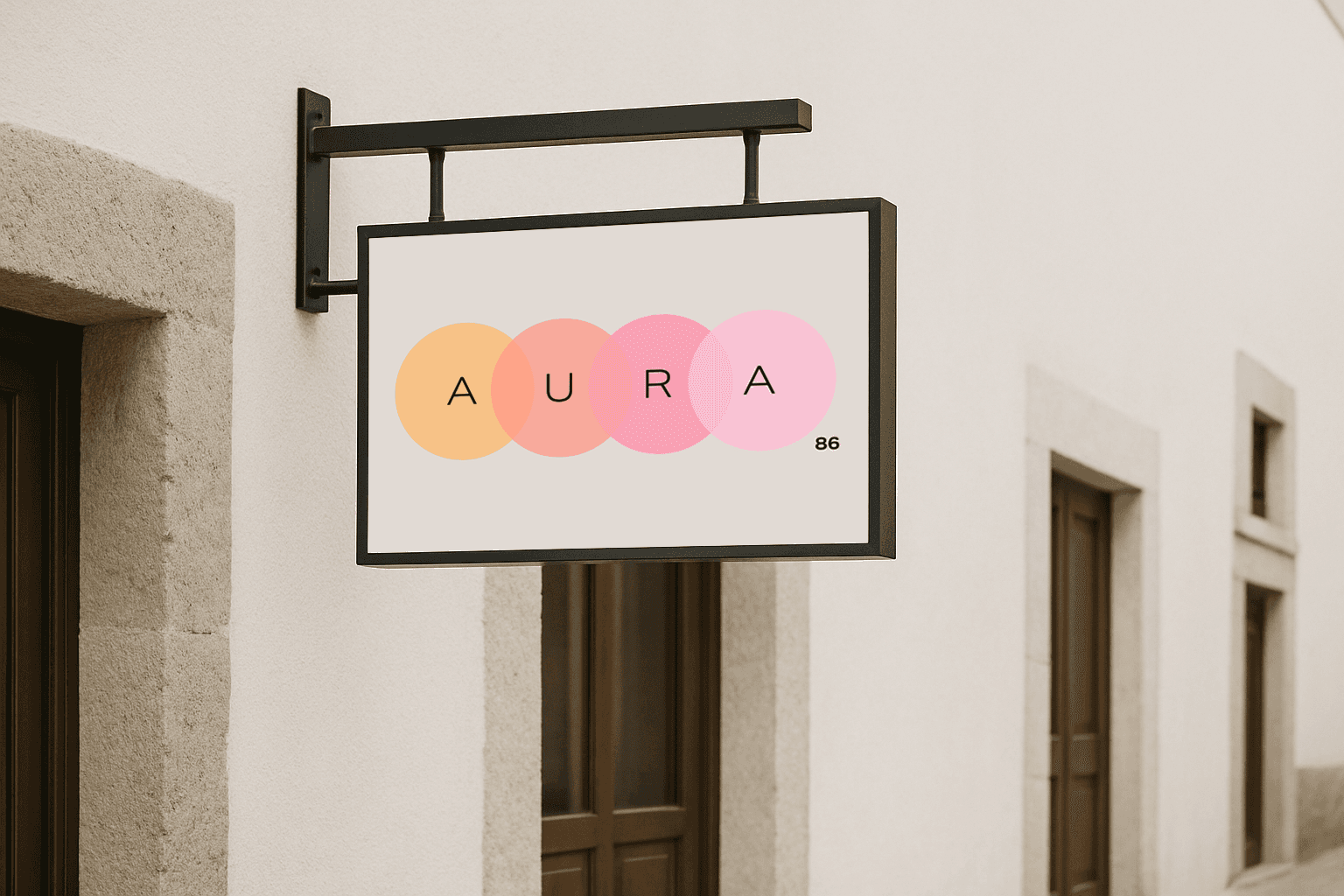
AURA 86 is a brand identity project developed for a beauty sanctuary concept based in Mexico City. The client envisioned a calming, nurturing space where hair care met holistic wellness, offering treatments focused on revitalization, balance, and self-care. Through collaborative brainstorming and visual exploration, I designed a cohesive identity rooted in softness, natural elements, and spiritual grounding. The final brand kit included a flexible logo system, color palette, typography pairings, and logo variations optimized for digital use.
Role:
Designer
Team Size:
1
Client:
Freelance
Project Type:
Brand Identity
Tools Used:
Photoshop, Illustrator
The client dreamed of creating more than just a salon. She envisioned a sanctuary, a space where beauty rituals became moments of restoration, where energy felt balanced and every detail invited calm. From the very first conversation, the idea was rooted in creating an environment that felt nurturing, intentional, and deeply personal.
My goal was to translate that vision into a visual identity that carried the same restorative spirit. The brand needed to feel intuitive, grounded, and emotionally resonant from the first glance. Every choice, from the fluidity of the logo forms to the warmth of the color palette, was made to reflect the sense of balance and care the founder wanted guests to experience.
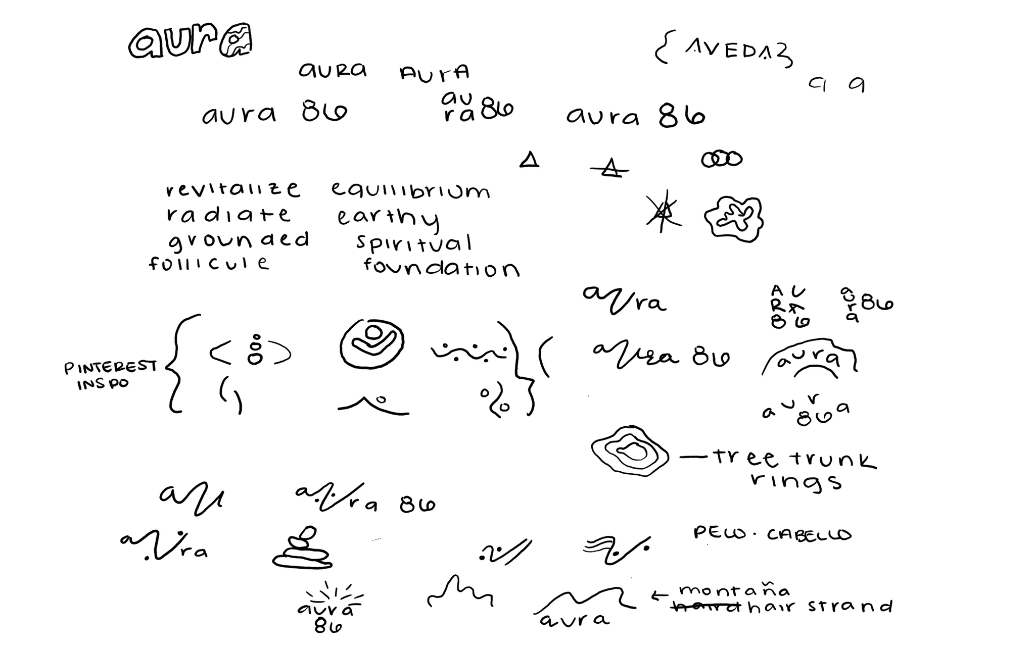
To kickstart the ideation process, I worked closely with the client to define the details of her vision. During our FaceTime conversations, I sketched in real time, translating her ideas into early shapes and layouts. I also asked her to curate a Pinterest board that captured the textures, colors, and moods she imagined. These early sketches and visual references became the foundation for developing the brand’s identity.

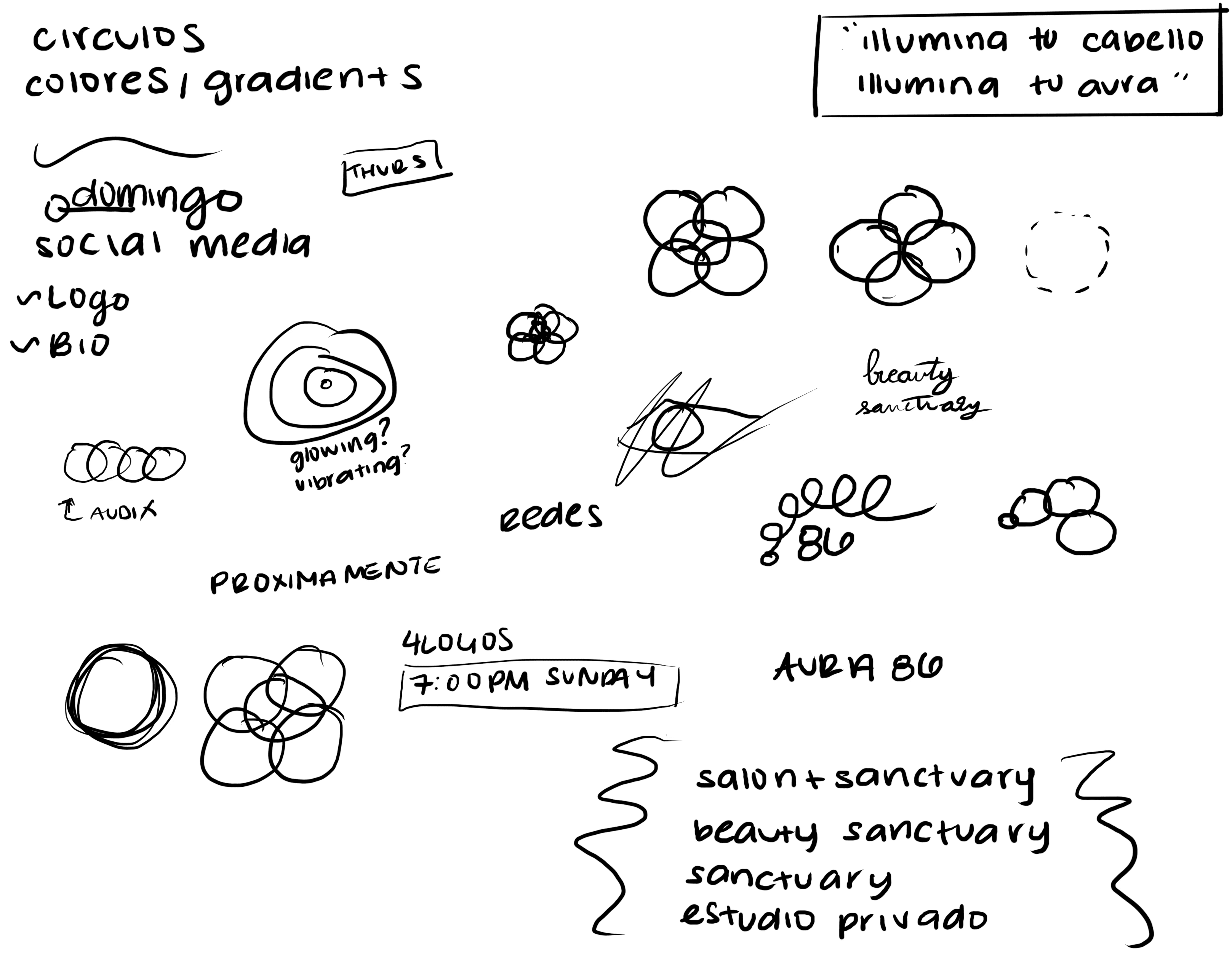

After our initial conversations, I continued developing the sketches, letting ideas take shape in my notebook whenever inspiration struck. I explored variations, adjusted proportions, and experimented with ways to balance softness and structure. To expand my visual vocabulary, I researched keywords tied to the brand’s essence, gathering fresh references that informed subtle refinements in form and composition.
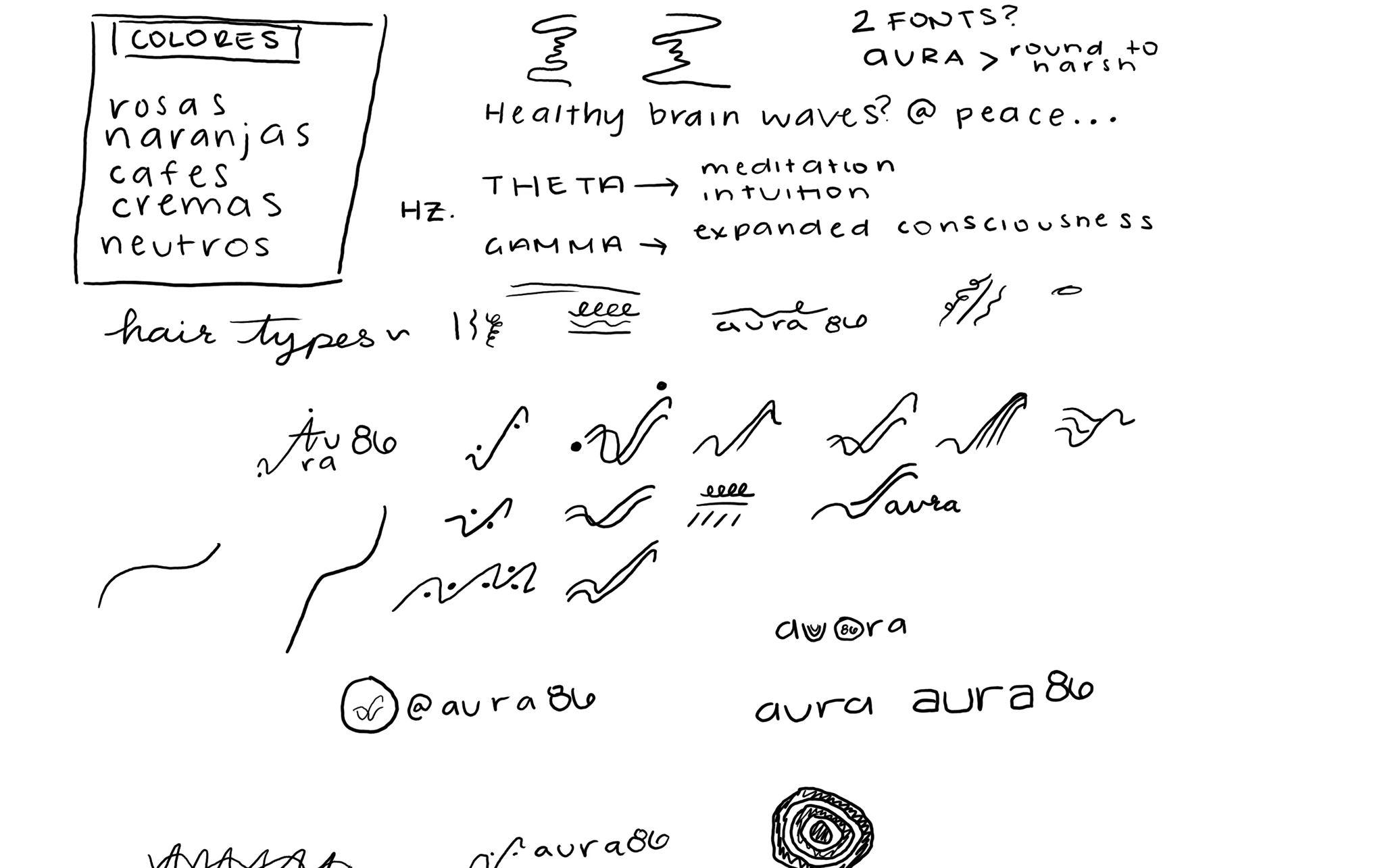
With the refined sketches as a guide, I moved into Adobe Illustrator to develop digital drafts. This stage allowed me to experiment with precise shapes, color families, and type treatments, exploring how each combination could carry the brand’s restorative feel. These variations became the basis for selecting the final color palette and typography.

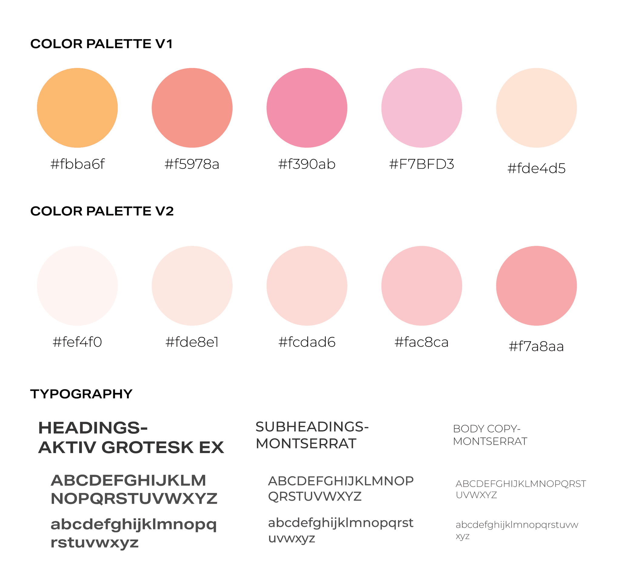
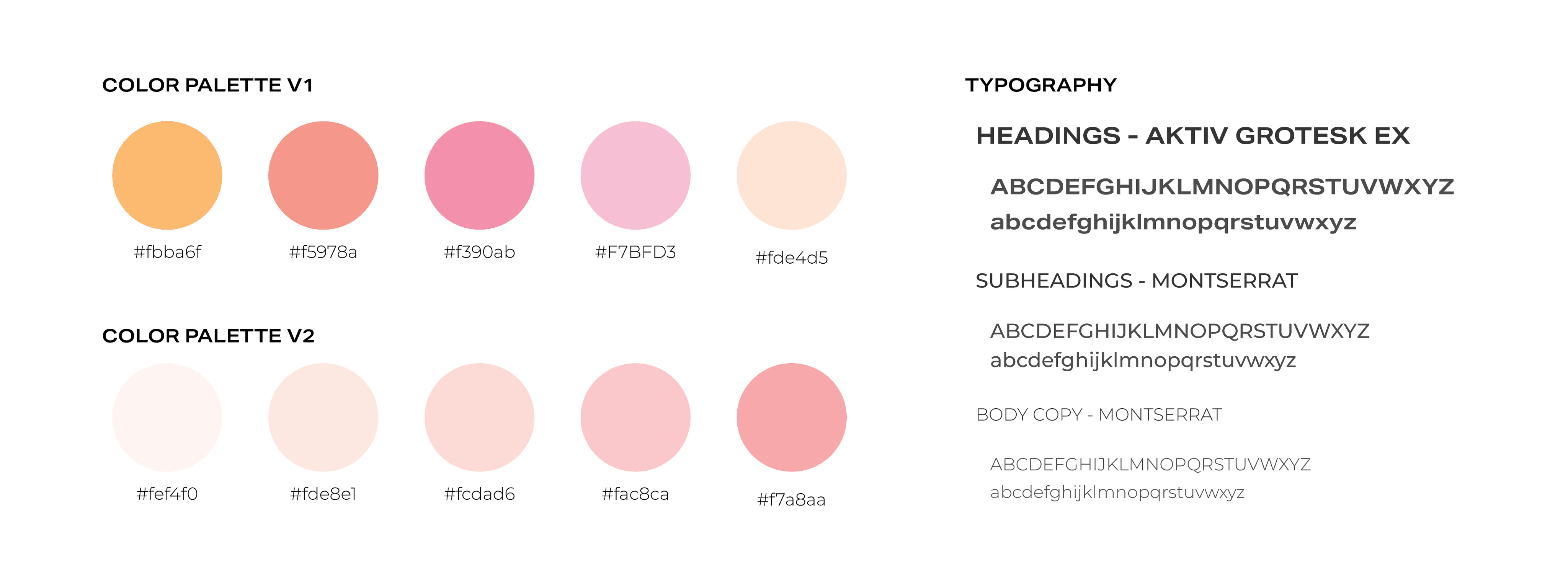
Color Palette
I explored two color directions for Aura86, each designed to reflect the brand’s sense of calm and balance. The palette showcased below — #fbba6f, #f5978a, #f390ab, #f7bfd3, and #fde4d5 — became my preferred choice for its warmth and depth, with tones that feel restorative yet vibrant. The alternate version offered softer, more muted hues (#fef4f0, #fde8e1, #fcdad6, #fac8ca, #f7a8aa) for a lighter, airier feel. Both were fully developed into brand kits, ensuring flexibility in the final application.
Typography
For headings, I selected Aktiv Grotesk Ex, a clean and modern typeface with subtle character that adds strength without overpowering. Montserrat was chosen for body copy, offering clarity and versatility while maintaining a welcoming tone. Together, these typefaces create a balanced typographic system that complements the brand’s color palette and overall personality.